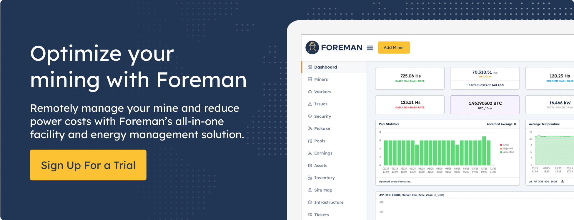
The Foreman team has been working behind the scenes in recent months to revamp the look of the entire dashboard. This initiative was more than a facelift; our goal is to enhance the user experience and modernize the interface - bringing a pleasant upgrade to what customers use daily.
Here's what's been updated:
Design Refresh: The dashboard now sports a clean, modern design that emphasizes ease of use and visual appeal. This update is not just cosmetic—it makes the dashboard more intuitive and efficient for users.
Dark Mode Improvements: The dark mode has seen substantial enhancements, bringing a more refined and comfortable viewing experience during nighttime, in low-light environments, or just for everyday Dark Mode power users.
Chart Enhancements: The data charts are improved for better clarity and interaction, helping users digest complex information quickly. Specifically, the pie chart for miner types is now more advanced, showing a more granular level of miners.
Branding Update: Alongside UI improvements, we’ve debuted a new logo as part of an updated branding strategy to reflect the platform's evolution and future direction.
Improved Color Contrast: We’ve fine-tuned the color contrast across the dashboard to reduce visual strain and improve readability.
Modernizing the design with these enhancements will elevate the dashboard's usability and enrich the user experience. We aim to create a more visually appealing, intuitive, and user-friendly environment. These updates are designed to streamline workflows and make the overall interaction with the platform more enjoyable and efficient. We hope you like it!


